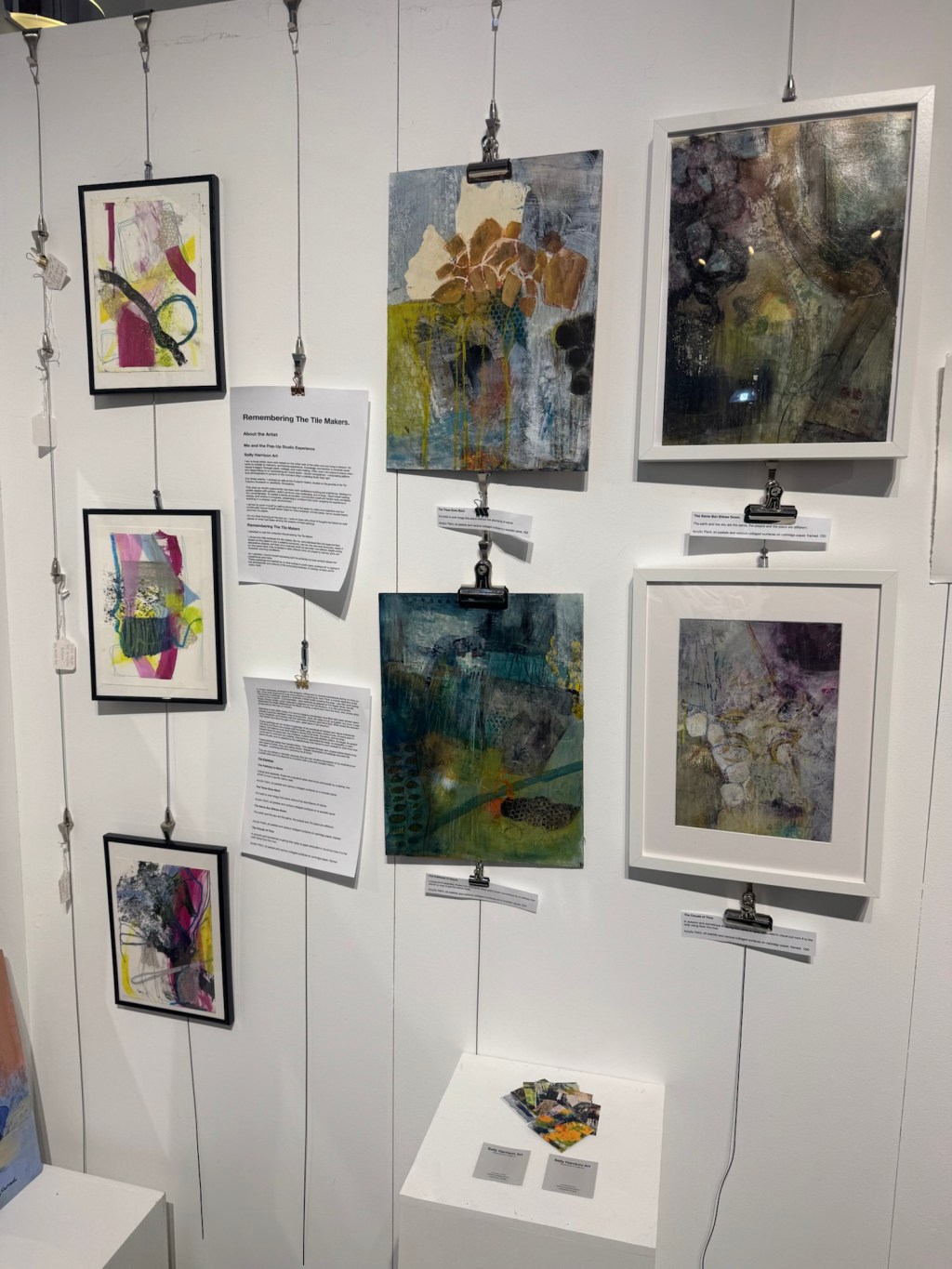
As part the continuing development of my art practice I am delving into what I do and why I do it.
Here in this exercise, I am concentrating on one of my smaller pieces and doing some deep diving and investigating.
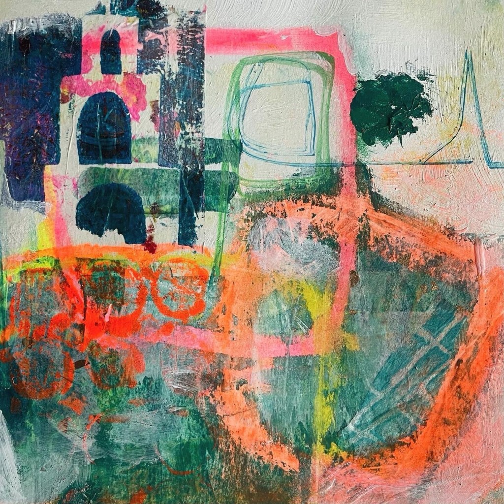
I chose this piece because I like the tower, it provides a good solid point of reference. The picture reminds me of holidays and I like the warm colours and the mixture of shapes. Its a good example of my style and previous paintings with similar themes that have been enjoyed and bought by others.
This piece makes me feel happy because I made it – whatever that means! I feel calm when I look at it, it brings back memories of holidays and happy times.
I was inspired to make this piece as a way to experiment with the tower stencil and the bright coloured oil pastels that were used to draw the squares. I was testing myself, trying to use different sizes and textures of marks and not overload the image with detail.
The purpose of this piece of work is, for me? An experiment, an exploration of balance, an exercise in mixing colour and shape, a vehicle for tuning into my intuition and finding that sweet spot of flow that means I am enjoying what I’m making and visually it’s hitting the right buttons. For the viewer, in practical terms it’s a small painting on strong card that would need a frame, I would hope that it would evoke happy feelings in them too, reminding them of holidays and trips. It makes me think of cold beers or mint tea at an outside table in a beautiful city, maybe Marrakesh or Seville, chilling after a day of exploring and ruminating on all the things they’ve felt and seen.
If I was to describe this painting to someone who couldn’t see it, I would say – its an image in the portrait layout, its abstractbwith some recognisable images. It wants you to think city with rural elements, like parks and gardens. In the top left hand corner is a white tower of three levels with central archways on each level and there is a background of dark blue. The horizon is a line across the top, third of the image. On that line is a large green square and a dark blue blob of paint. Inside the green square is a thin blue outline of another square. The bottom two thirds of the image is split into two areas vertically. On the right and side is a large outline of an orange square leaning slightly on its side. On the left is a rectangle that intersects across the orange square and across underneath the tower. The divided spaces are full of mixed blues and greens.
The colours are bold. The top area has a simple monotone palette and the lower 2/3s is more complex and textured. There are scratched marks and textures in the greens and across the edges of the orange lines. There’s another blob in the bottom left hand corner, this is more sploggy and more green that the one in the top right corner. There’s a pattern in the bottom right hand corner that looks like a map or a town plan. There’s a yellow square in the left half of the bottom half that is glowing through the green. The image has a playful mood and the colours are like sundown in a city when you sit at a bar with a beer.
Its only a small picture on a piece of cartridge paper.
There are lots of layers with colours coming through from the paper below and underneath the paint and the tissue paper collage which has been printed with stencils.
The subject is simple, a tower and some gardens but the colours and lines are more complex, they combine and weave together to create an atmosphere of warmth and glowing light.
The keywords that I have identified from this exercise are:-
Abstract. Tower. Bold colours. Travels. Texture. Map. Playful. Layers. Atmosphere. Calm. Memories. Pleasing shapes. Mark making. Coordinating shapes. Balance. Exploration. Contrasts. Flow. Paper.


Leave a comment